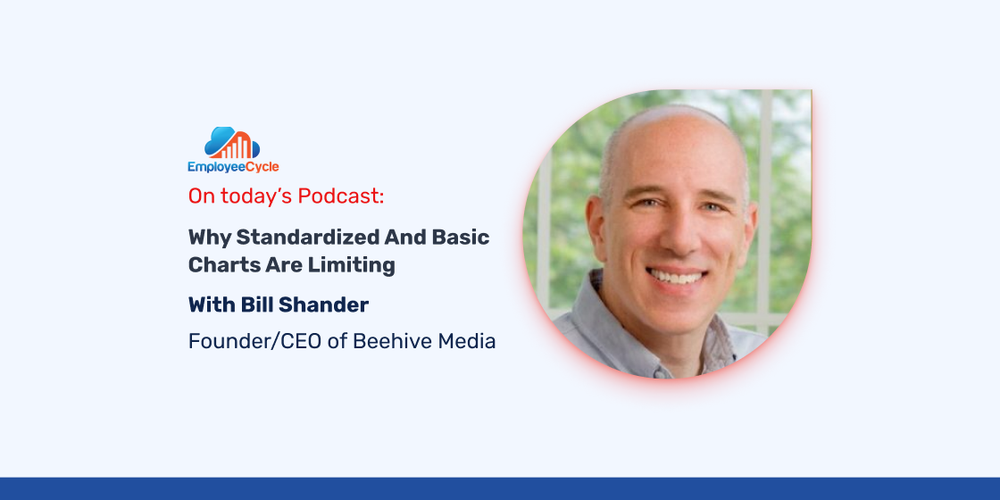
Describe what you do in one sentence:
Information design and data visualization.
What you’ll learn from this episode:
– Why standardized and basic charts are limiting.
– The process of taking complex data and turning it into a simple visualization.
– Why do human beings retain so much more information when a visual is associated with the data.
– Why the best way to present data is to allow users to explore the data at the specific level where they are most comfortable.
– The importance of creating specific context around data based on your target audience that will be engaging with the data.
– Why humans are really bad at measuring circular objects (ie, pie charts).
– How to create visual and interacting experiences that are useful.
If there were one class you think all students should take, what should it be?
Everyone should take classes 1) to understand programming on a basic level, and 2) to understand the role of civics and journalism in our society.
If you could travel back in time, when would it be and why?
Slightly into the future, maybe 10-20 years ahead of now to see how things have changed.
Data visualizations discussed on the show:
CGAP Financial Diaries: http://www.cgap.org/sites/default/files/publications/multimedia/smallholder_diaries/index.html
Impact: Evaluating the Impact of STEM Buildings: http://stem-impact.eypaedesign.com/
Bill’s books recommendations:
Alberto Cairo “The functional art” http://www.thefunctionalart.com/
Stephen Few “Show me the numbers” http://amzn.to/2fZhucv
Giorgia Lupi & Stefanie Posavec “Dear data” http://www.dear-data.com/
Find Bill Online:
LinkedIn https://www.linkedin.com/in/billshander
Twitter: @billshander : https://twitter.com/billshander
Website: beehivemedia.com
Projects: http://beehivemedia.com/?does
Website: https://rockthevizcomm.com/
About the host: Salas Saraiya is co-founder of the HR dashboard Employee Cycle.