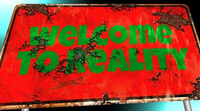
So you’re interested in this dashboard thing you keep hearing about. I feel you.
Dashboards have become very popular lately, with everyone wanting a dashboard for everything and anything. Since the word dashboard is being thrown around like a rag doll, I figured it might be worth starting with the basic understanding of a dashboard, and why we use them in the first place.
I personally like to define dashboards as information broken down into a collection of visual graphics, that otherwise would be difficult to digest or understand at a glance. Visual representations of data that by themselves are just charts, graphs and pretty pictures, but when put together tell a compelling story of the past, present, and future.
If a picture is worth a thousand words, then a dashboard is worth a thousand pictures type of thing.
When used correctly, dashboards should only display the most important, relevant, timely, and actionable data around a specific topic. Although the thought of cramming as much data as possible in a dashboard might sound attractive, busy dashboards are counterproductive, and don’t help anyone.
RULE TO FOLLOW: If everything becomes important, then nothing is important, so dashboards should follow the rule less is more!
So now let’s look at a popular dashboard as an example.
I’m not sure if the car had one of the first dashboards around, but we’re going to use it as our foundation since it’s one of the best examples I know.
Fyi, I know there’s a lot of people using Uber or Lyft now, and may not even have their driving license, so if you’re one of those people, just try to keep up. For the rest of you old school drivers out there, walk with me on this journey.
Dashboard Design
Have you ever thought about how your car dashboard looks? Ever wonder how the designers of that dashboard chose what should be there in the first place, how should everything be positioned, and the size of every gauge or alert? Or better yet, why certain displays are always on the dashboard, while others only pop up when there’s an issue?
I’m sure you’re curious now, so let’s look at some of the factors that determine the design of a dashboard.
Frequency
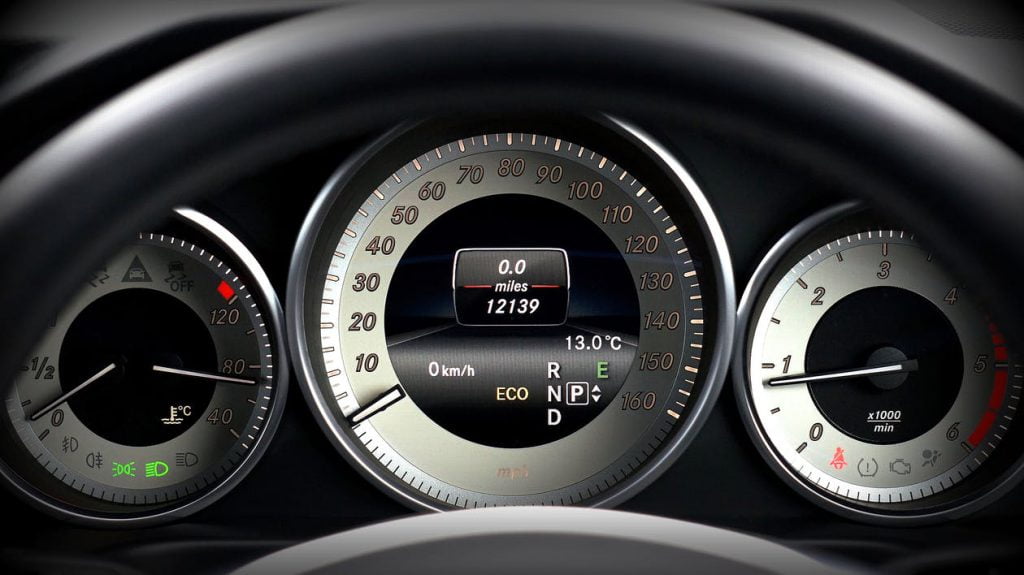
When you look at your car dashboard, the largest visual representation of data is the speedometer, which is telling you how fast your car is traveling. Now I don’t think anyone would say that knowing how fast you’re moving is not important, but one could argue that other things could potentially be more important, right? Things like how much gas do I have left? Are my tires almost flat?
To answer this question, we have to look at how “frequency” comes into play with data. Frequency determines how consistent we need to see certain information. When you think about it, what’s the thing you look at the most while driving? Hopefully you’re not looking at your tires, brakes, or gas every 5 minutes, or even every day. But your speed? That’s something you’re “tracking” the entire time your car is moving. So since your speed changes more frequently than anything else in your car, and it’s the “data” that you “track” the most, it wins the spot as the largest display. This is a great example of showing why data that changes pretty regularly should be front and center on your dashboard.
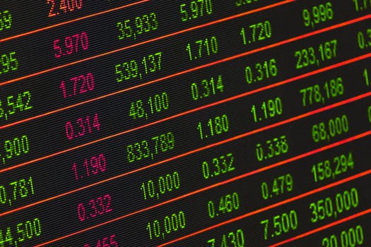
Now I know frequency can be relative in both your personal life or business. For instance, everyone isn’t going to track things to the millisecond like a trader watching the stock market.
But there’s more common examples of areas in your personal and business life that you track frequently with some sort of dashboard.
For instance…when you check your bank account online, don’t they give you a dashboard to see what’s deposits, payments, and what’s pending? I’m sure that frequently changes, and you appreciate being able to see all of that information. But what’s the most important data you care about that’s front and center? You guessed it…your account balance.
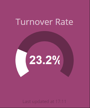
Or what about when your business is growing quickly, and you’re tracking employee turnover to understand how fast employees are quitting or getting fired. There’s lots of information your payroll or HRIS system is showing you about your employees in their dashboard, but one of the most important metrics that changes pretty frequently is your turnover rate. You probably want that front and center.
Dashboard Displays (visuals)
Next we want to cover why certain types of display designs are used for communicating certain types of data. We’re going to keep this section short, since we’re not going into the science of data visualization, but if you’re interested in a deep dive, you should definitely check out the awesome book Storytelling With Data.
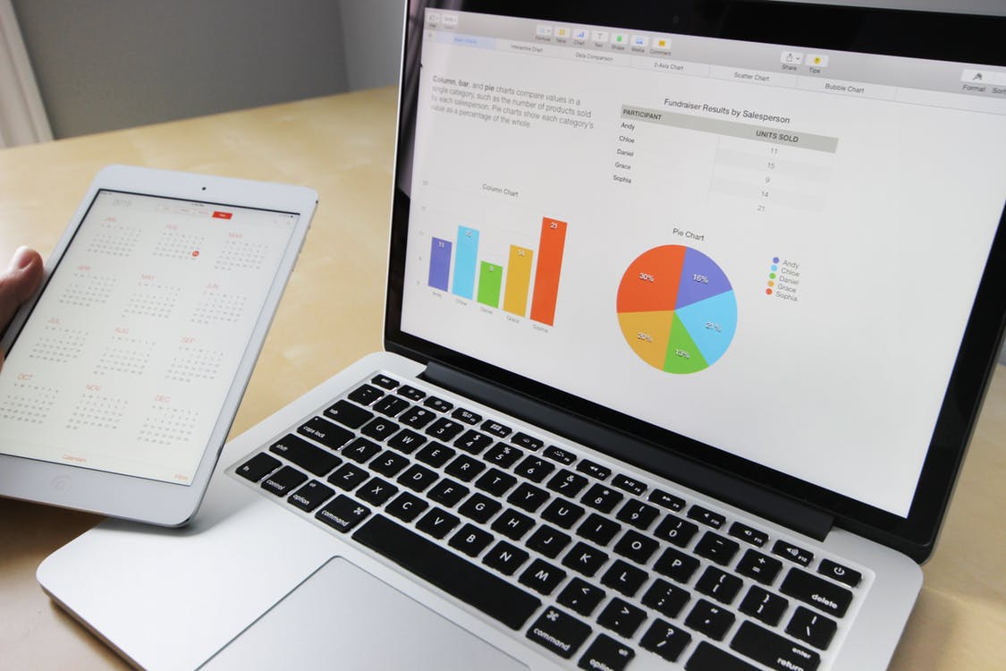
Since middle school math, you’ve been seeing numbers represented as images including pie charts, bar graphs, and other types of ways to quickly tell a story with data. A dashboard is the best place to put these skills to use, since it’s all about the ability to understand data as quickly as possible.
So back to our car dashboard example. The speedometer is typically a large circle with the numbers representing the speed right inside the circle. The speed increases from left to right, and while driving, we’re able to gauge how fast or slow we’re moving.
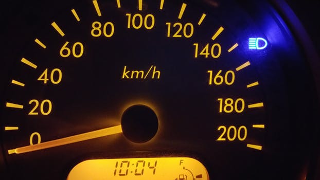
But what if instead of a circle, it was some crazy line graph that you barely read?

Would you be able to quickly and easily understand exactly how fast you’re moving? It would be pretty scary knowing you were driving next to someone with this right. If you’re more interested in seeing examples, click here to see weird car dashboards.
There’s plenty research proving as humans that we understand data when visualized better in certain ways than others, which is why most of the well-designed dashboards typically use the same types of visuals for the same types of data. This was all a very descriptive way of saying that dashboards need to use commonly understood visuals to communicate data, making sure the learning curve of reading the data is effortless, allowing you to spend brain power on what the data means.
How Does This Help You?
So what does all of this mean to you, and why are we talking about dashboards in the first place?
For all of you kickass HR, people leading superstars reading this, we understand that your job is on the line to become more data-driven, and you’re now being held more accountable than ever to perform against specific HR metrics.
And with that comes the following:
- Identifying which metrics you want to track in the first place.
- Downloading tons of spreadsheets from all of your different HR systems.
- Trying to turn all of it into one understandable report or presentation.
- Probably not having enough time to really analyze it.
- Wash. Rinse. Repeat. Creating reports for the sake of creating reports and not really getting the value out of it.
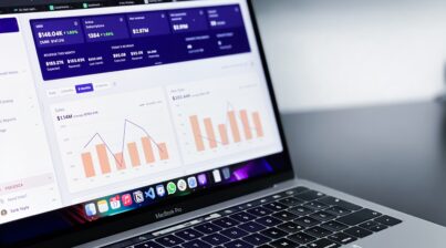
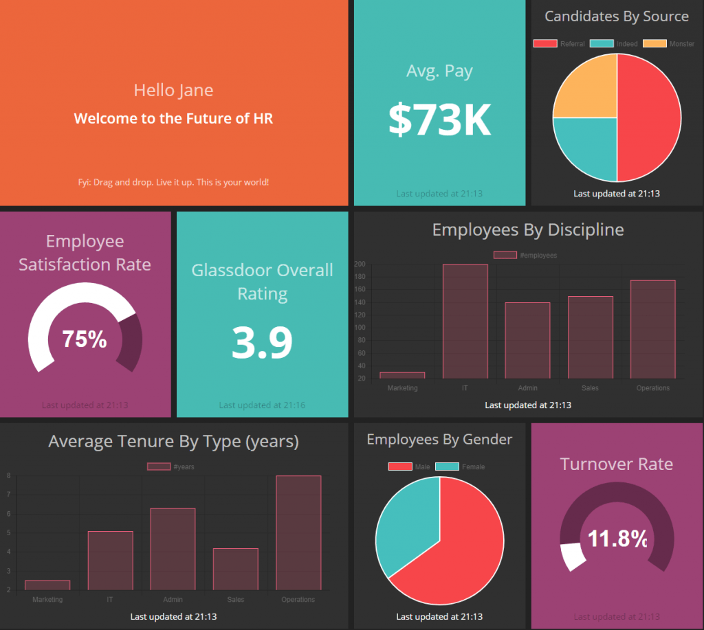
HR Metrics Dashboard
Since we know you’ve been looking for a better way to stop spending all your time creating reports, and more time on actually analyzing the data to make better decisions, we decided to help you by creating Employee Cycle.
That’s right. Look no further since Employee Cycle is your user-friendly HR Metrics Dashboard that connects to all of your HR systems, and automatically pulls and organizes your data into a goal-based HR Dashboard that helps you become the data-driven superstar you know you are!
Here’s the best part. We’re exclusively focused on connecting with HR systems, and working with HR data. We know there’s other dashboards out there that try to focus on being the entire dashboard for the entire company, but we know better than to think you can focus on everything, and also be the best HR dashboard out there. We focus on the very specific goals and context of HR, truly understanding your workflow and how you need to track, manage, and analyze data.
As we said earlier, if everything is important, than nothing is important. For us, only HR is important!
Conclusion
Data has become an extremely valuable currency, especially in the boardroom. If you are responsible for managing for the workforce, it is mission critical that you’re using data to understand the past and present of your workforce.
If you would like to learn more about how Employee Cycle can help you make smarter workforce decisions faster, click here to get a demo.